What surprised you about the findings?
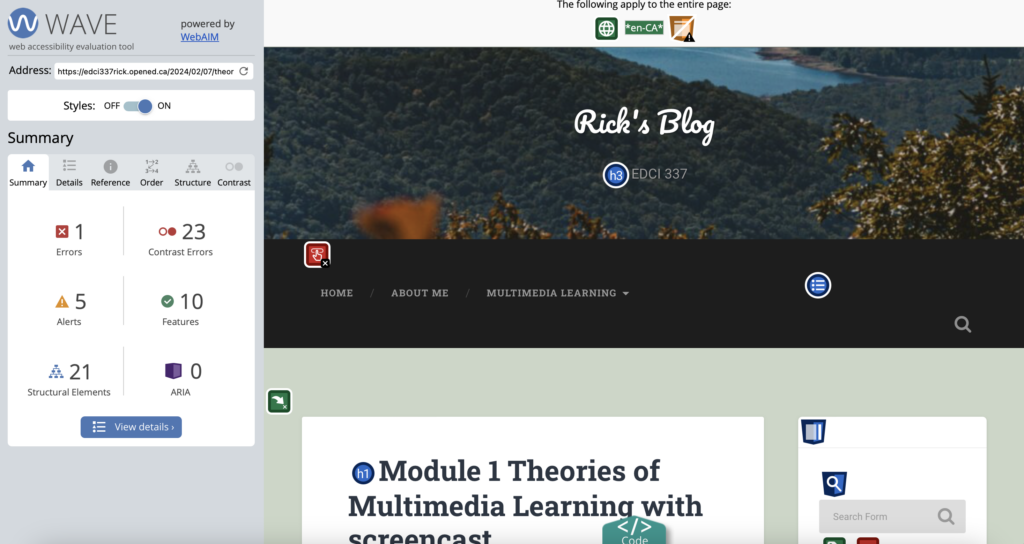
Upon using a web accessibility evaluation tool, I noticed a significant number of contrast errors that caught my attention. Personally, I opted for diverse colors to ensure that my blog page is organized and vibrant. However, upon further investigation with tools like WAVE, it became apparent that some of the colors I chose might not adhere to page design standards.
Additionally, I realized that my page contains a button that lacks both information and functionality. This is a notable issue that I intend to address in the future.
What will you change going forward?
After utilizing WAVE, I’ve recognized its utility as a valuable tool for designers to identify overlooked issues or errors. Moving forward, I intend to focus my efforts on refining the page’s structure and ensuring better color coordination. By addressing the errors flagged by WAVE, I aim to enhance the browsing experience for readers
Have you used Text to Speech tools before? Did you find it useful? Did you try out some of the different voices? What impact did the different voices have on your ability to absorb information?
I used Text to Speech tools before. In the Apple system, it is quite often to use this tool when I found some interesting voice and share with my classmates or friends. I prefer a more natural-sounding voice, but robotic voice more suitable for certain contexts. The mellow voice is able to make me to concentrate on the content of voice message, and I can easily capture key information from the voice message.
What does inclusive design mean to you?
For me, Inclusive design involves creating products, services, and environments that are accessible and usable by a diverse range of people, including those with disabilities. It aims to ensure that everyone, regardless of their abilities or characteristics, can engage with and benefit from the designed solution.

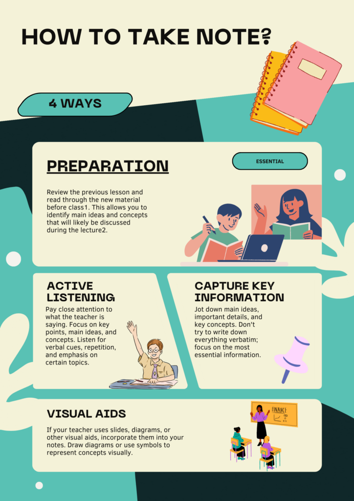
Which design principles did you use to create your infographic in Canva? Which elements of a ‘good infographic’ were you able to incorporate? What other principles did you consider? What does the template make easier and what does it make harder when creating your infographic?
In creating this infographic, I strategically applied the design principles of hierarchy, consistency, and contrast. These principles were instrumental in ensuring that the infographic effectively communicates the order and importance of information, maintains a cohesive style and layout, and engages the audience through contrasting elements for visual interest.
Utilizing Canva, I took advantage of the diverse templates available for users. This feature allowed me to select templates tailored to different topics. For example, when choosing the topic “how to take notes,” a simple keyword search yielded a template specifically designed for this subject.
While exploring Canva’s template options, I observed that some templates incorporated numerous images and employed a wide range of colors. This approach may pose challenges for individuals with color blindness. Conversely, I also noticed templates that adhered to a single color scheme throughout the entire infographic. This design choice has the advantage of promoting focus on the content itself, rather than relying heavily on images and color variations. This consideration is especially valuable for ensuring accessibility and inclusivity in the presentation of information.
Leave a Reply
You must be logged in to post a comment.